In this blog: Nextdoor offers businesses a unique way to connect with local customers through trusted neighborhood conversations and recommendations. …
BLOG
Where strategy meets results, and we break down what’s working, what’s next and how to turn data into meaningful growth.

Where has discovery gone? Find out how you can capitalize on modern search to drive positive business outcomes.


Where strategy meets measurable impact. Here, we dive into data-driven tactics that drive real results—leads, conversions, ROI.

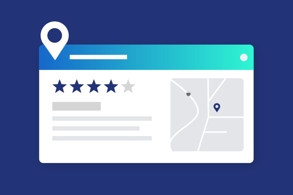
Is your website holding you back? Learn how it shapes your reputation, attracts the right leads and drives lasting success.
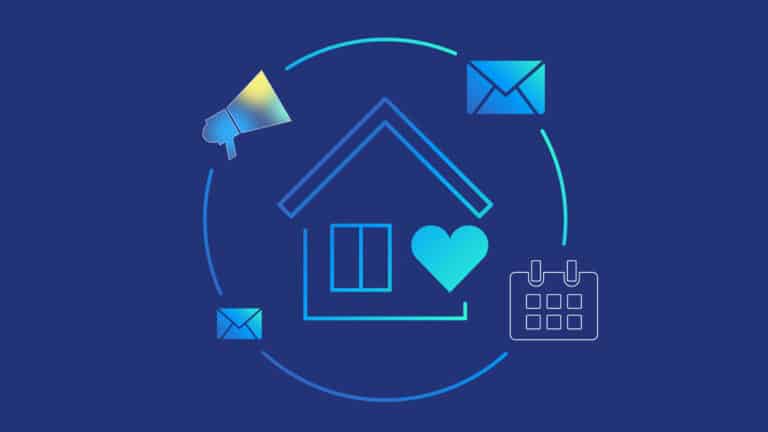
Learn how to nurture your audience with winning email strategies in our guide to email marketing for home service businesses.

Instagram just dropped some major insights into how their algorithm will work in 2025, and we’re here to break it…
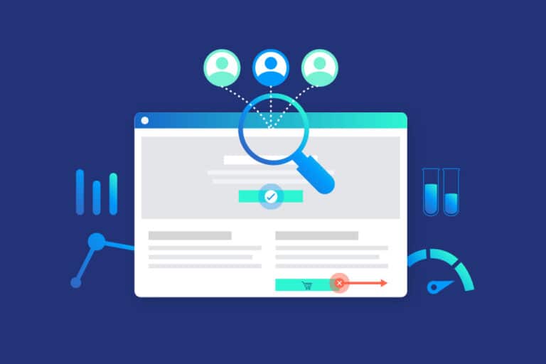
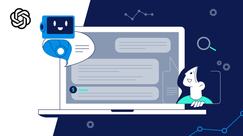
What if you could double your conversion rate without spending a penny more on ads? Conversion Rate Optimization (CRO) is…
See what happens when strategy meets execution. Our case studies highlight the impact of smart marketing, sharp ideas and measurable growth.
Get the latest on new partnerships, launches and milestones shaping what’s next at TriMark.

This recognition highlights our commitment to design that’s driven by strategy, testing and optimization to deliver measurable results.

The service will be piloted in local markets, with marketing efforts designed to generate awareness and drive bookings.

This news comes as TriMark restructures its business, evolving and expanding its service offerings while deepening engagements with clients.
This recognition highlights effective digital strategies, creative execution, and measurable impact within the healthcare sector.