
Client
CAPTRUST
Services
Audience Discovery, Website & UX Strategy, Website Design & Development, Content Strategy, Organic Strategy, Conversion Strategy
A Website Redesign Reflective of CAPTRUST’s White-Glove Approach
The Challenge
Founded in 1997, CAPTRUST is an independent registered investment advisor serving ultra-high-net-worth individuals and institutions across the U.S. The firm prides itself as a trusted fiduciary and vigilant steward of its clients’ best interests.
CAPTRUST needed an updated website that more effectively communicated its core values and best-in-class customer service to three core audience groups. It was imperative that the design and user experience mirrored premium brands and stacked up against industry competitors.
Our Solution
Our team devised a four-part strategy to elevate and personalize CAPTRUST’s site experience, driving a 78% increase in engaged sessions.
Defined
Audiences
Custom Audience
Journeys
Human-Centered
Design
Unique Location
Pages
Step 1
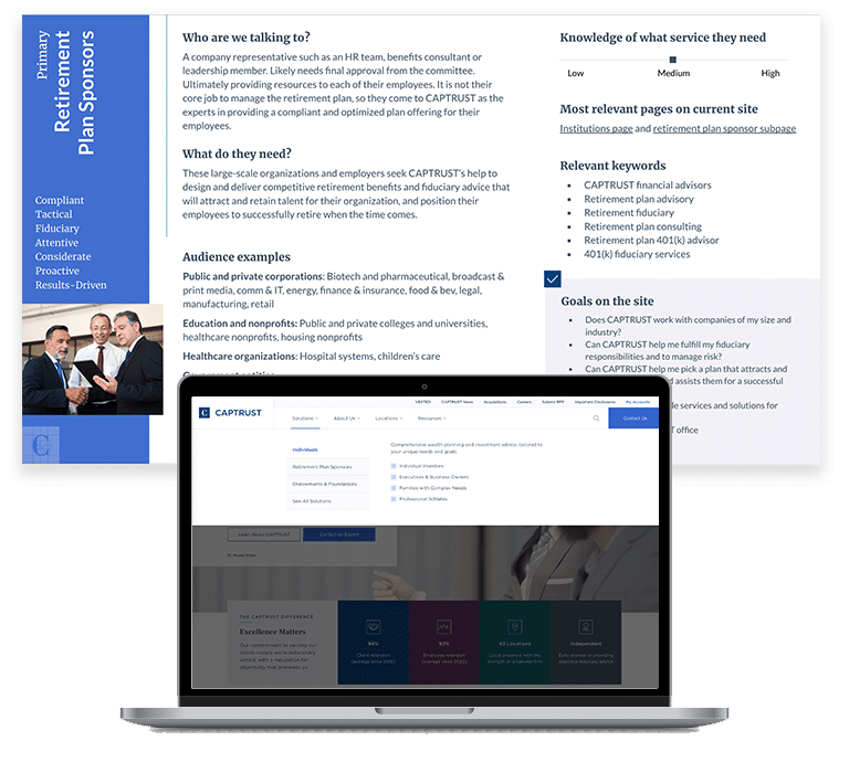
Defined Audiences
CAPTRUST has three primary audience types defined by their unique needs: Individuals, Retirement Plan Sponsors, and Endowments and Foundations. Each audience type offered further ways to distill and get more granular. We drilled into each with custom audience personas, outlining their working style, knowledge level, site goals, and most resonant calls-to-action.
Armed with this information, we were able to make smart choices during the design and content writing phases. For example, we also updated the site’s navigation and structure to clearly funnel users to the most relevant child page.
Step 2
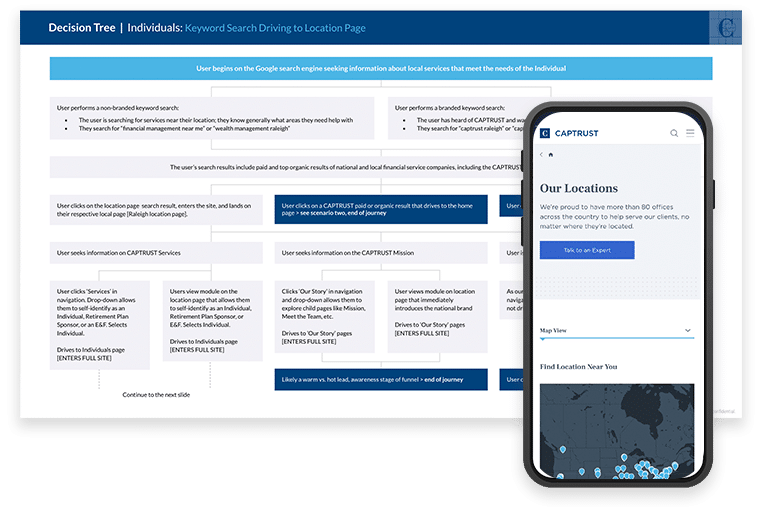
Custom Audience Journeys
Once we’d defined CAPTRUST’s main audiences, we knew a well-constructed website would revolve around anticipating their unique user experience. By using decision trees, we predicted each step along the way for each audience type. We thought through how each user type found their way to the site and traveled with them to possible endpoints they could reach on the site.
Whether they wanted a look at CAPTRUST’s value set, wanted to know their nearest location, or were ready to take the step to meet an advisor, we ensured taking the next step was a seamless process with site experiences centered on tailored decision-making.
Step 3
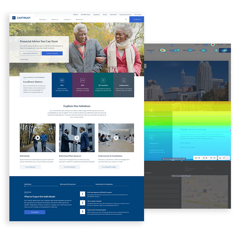
Human-Centered Design
This project required a best-in-class user experience that mirrored the white-glove service clients receive from CAPTRUST offline. To elevate design across the site, we:
- Ensured every element of the site was ADA-compliant with high-contrast brand colors, highly visible calls to action and pause options and transcripts available for all videos.
- Rewrote and refined site content to reflect Hotjar findings around the most highly visible and relevant areas on site.
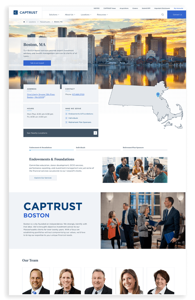
- Used people-focused imagery, especially on the local pages, to bring life and a human element to the site.
- Took inspiration from familiar filtering used on eCommerce sites for the blog content, so customers can quickly find the tailored content they need.
- Created a streamlined site backend so CAPTRUST’s team can navigate and update site elements with ease in the future.
Step 4
Unique Location Pages
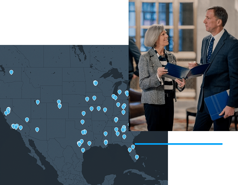
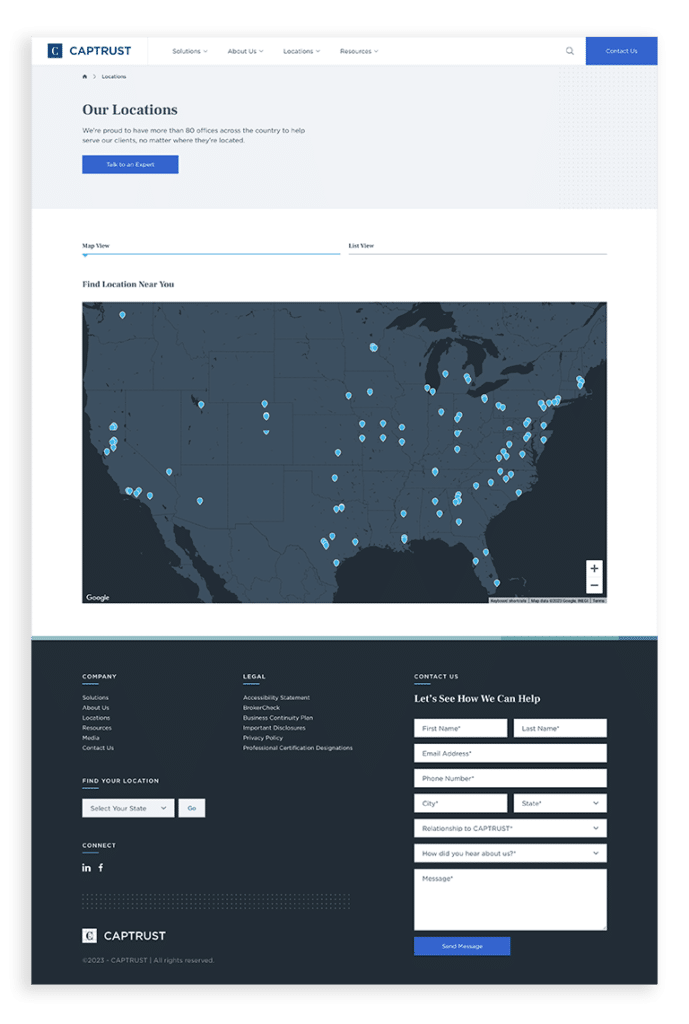
One of CAPTRUST’s biggest advantages over its competitors is its national footprint which can be tapped to support any client need.
To capture local search traffic, our organic strategy centered around launching core office location landing pages to work alongside their 70+ Google business listings. This put a very literal face to their many locations and added a customer-friendly funnel directly into the site for a more conversion-focused site experience.
CAPTRUST’s growing list of locations added another moving element. CAPTRUST’s new site needed to be agile, able to keep up with their growth yet still easy to navigate for potential clients. We addressed this with a standardized template that could be easily replicated.
The Results
New users were up 60% and sessions were up 54%, meaning more potential clients were finding the site as a result of our strong location and GMB strategies. Once on-site, the average engagement time per session was up 12%, indicating that the enhanced content, design, and UX keep potential clients interested and match their search intent. The number of sessions that had 2+ page views or resulted in a conversion event increased by 78%.
- 60%
- Increase in New Users
- 54%
- Increase in Sessions
- 12%
- Increase in Average Engagement Time per Session
- 78%
- Increase in Engaged Sessions

Awards
We don’t do it for the hardware, but awards are win-win-win.
Our Work
See how we’re making our mark on brands of all sizes, in all industries.
Spend smarter. Scale faster.
Talk with our performance marketing experts.
"*" indicates required fields