As people continue to cut traditional TV in favor of streaming, where and how they watch is shifting. Explore our ...

If your brand hasn’t started investing in user experience design yet, now is an excellent time—UX could be affecting your business’s bottom line! Research shows that when customers have a good experience on your site, they are more likely to purchase a product. So, how can you ensure that your customers have a positive experience with your brand? Here are five signs that you need to improve your site’s user experience.
In today’s era of viral TikTok videos and Instagram ads, users expect to get a lot of information in a short amount of time. That means if your site takes a long time to load, then users are going to leave. Research shows that the first 15 seconds can make or break the user experience for your site, with most users abandoning the page if it doesn’t load after 20 seconds.
In summer 2021, Google released its Page Experience update that ranks sites based on the user experience. If your site takes a while to load, it could harm your rankings. To avoid this, add UX checks to your launch site checklist.
Web accessibility awareness has rapidly increased in the past few years. People now recognize that more accessible web design leads to a better user experience for everyone. Music streaming app Spotify is an excellent example of designing for accessibility in its user interface. Spotify recently published a blog post about how they redesigned their buttons to accommodate low-vision users. This example shows that every step towards accessibility is a chance for a better UX on your site.
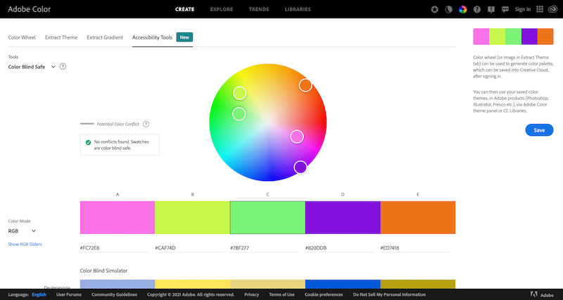
To improve the UX for your products and brand, consider testing the color contrast for accessibility. Run your site through an accessibility checker and see where it falls on the Web Content Accessibility Guidelines. The WAVE AIM checker and the Adobe Color Wheel are both excellent tools to help you check accessibility.
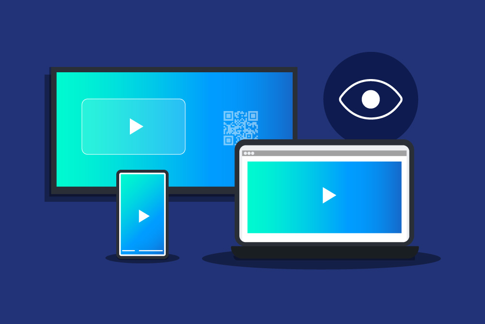
Design trends happen for a reason: to constantly improve. You want to show that your brand is innovative and adjusts to meet user needs. In a “mobile-first” world, your website needs to be fully responsive and built for touch devices. Use web analytics data to learn about your audience to design for the devices they use and the experience they expect. People constantly change. If your site doesn’t reflect how your users change, you lose a competitive edge in an ever-changing digital world.
Does your landing page have a high bounce rate? You might be presenting too much information to users all at once. Hick’s Law states that the time it takes to make a decision increases with the number and complexity of choices. Divide your content into sections so that you don’t overwhelm your users. Try a minimalist design so that your webpage can breathe.
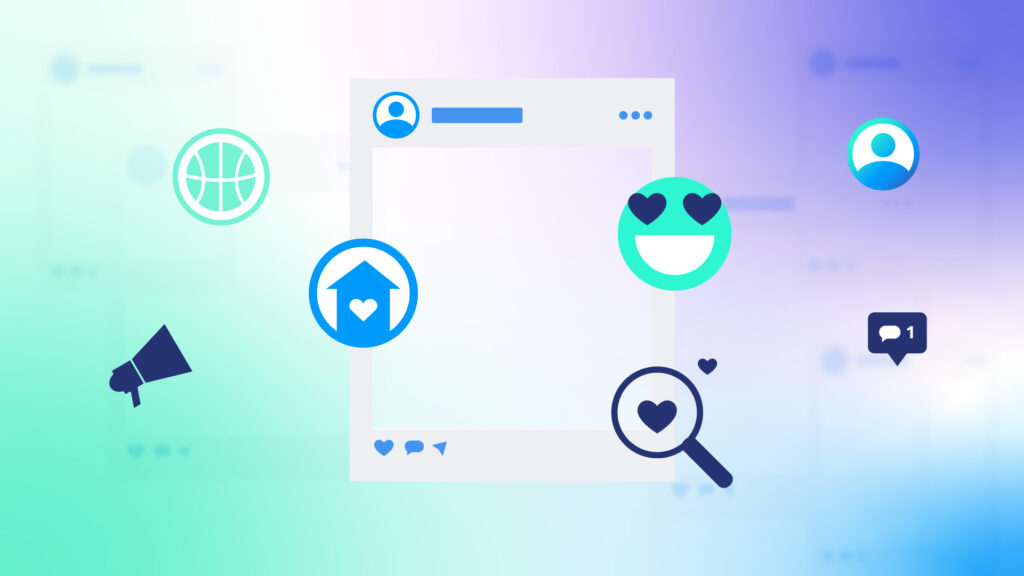
Some brands make the mistake of presenting all the information at once in case users leave their site quickly. Instead, try to write more engaging hooks that draw users in and make them want to stay. Be sure to break up any large paragraphs into smaller ones so that users can scan them. You can also add visuals and photos to break up large chunks of text.
Do you notice that your users aren’t scrolling far down the page? Chances are your site does not use the Inverted Pyramid Method, or the F-shaped Pattern, to structure your content. With this method, you present the most relevant information toward the top of the page, so your site has a logical flow. This strategy will prevent users from leaving because they couldn’t find the content they need.
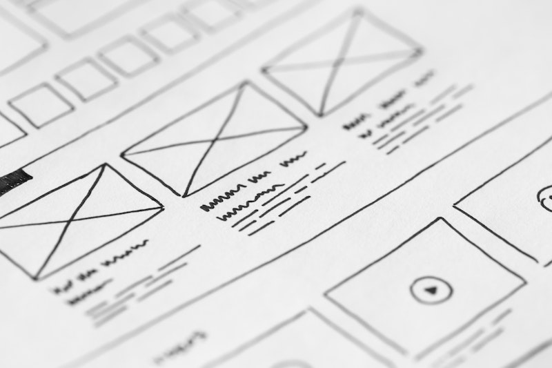
Don’t know where to start? Try wireframing. Wireframes are a minimalist portrayal of your site or product’s user interface (UI). Wireframes also show your site’s content hierarchy and functionality, which are essential to the user experience.
You can use wireframes during a usability test to evaluate your site. For example, you can show a potential user a wireframe of your new site and ask them to find the Help button. Wireframes can help you find potential UX issues before your new site goes live and ensure a positive first impression of your brand.
The best advice for your site to perform well and provide a positive user experience is to listen to your users. They have the best feedback on how to ensure your site stays valuable and informative to your audience. They also can tell you which parts of your site are the biggest pain points.
Stay tuned to our blog for more UX tips and advice.